Architect’s story (LIYOMARK)
The Bella Vita project was quite intriguing to me. There were crucial issues in the business that had to be addressed with architecture. In Negombo, there was an Italian restaurant called Bella Vita. My client, Mr. Nisala Appuhamy, is a well-experienced chef who is knowledgeable in Italian cuisine and culture.
Bella Vita was a well-established Italian restaurant at the time. He was focusing on delivering quality food to the customers. Lateron, He wanted to enhance the dining experience by combining architecture. That’s how the restaurant was refurbished. Several of his buddies questioned him about the refurbishment because it had been constructed less than two years ago. He had a clear vision to redesign it. There were lots of negative pressures acting on the project.
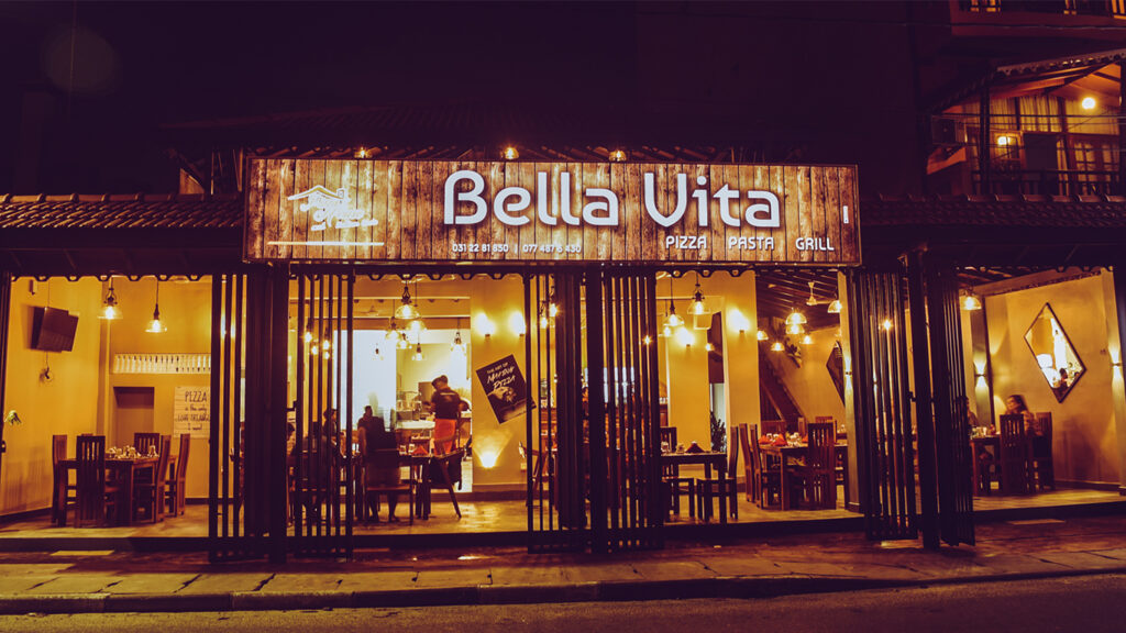
My client had a clear vision to enhance the ambiance of the establishment by redesigning it. The previous appearance of the restaurant did not convey the real experience of dining at an Italian restaurant, nor was it a traditional establishment. My client envisioned improving the restaurant to international levels. I proposed that we rebrand Bella Vita to Leonardo. The entire concept was inspired by Leonardo da Vinci. Finally, Bella Vita by Leonardo was created.
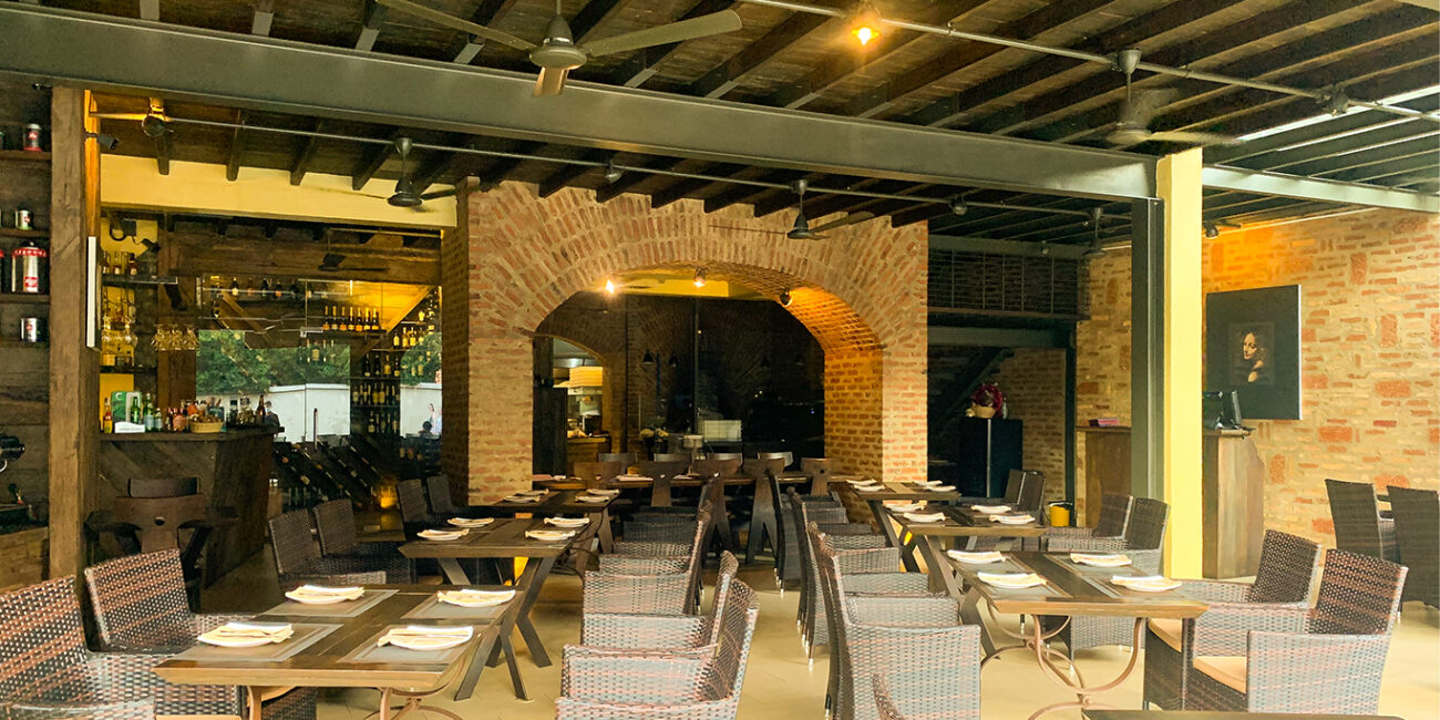
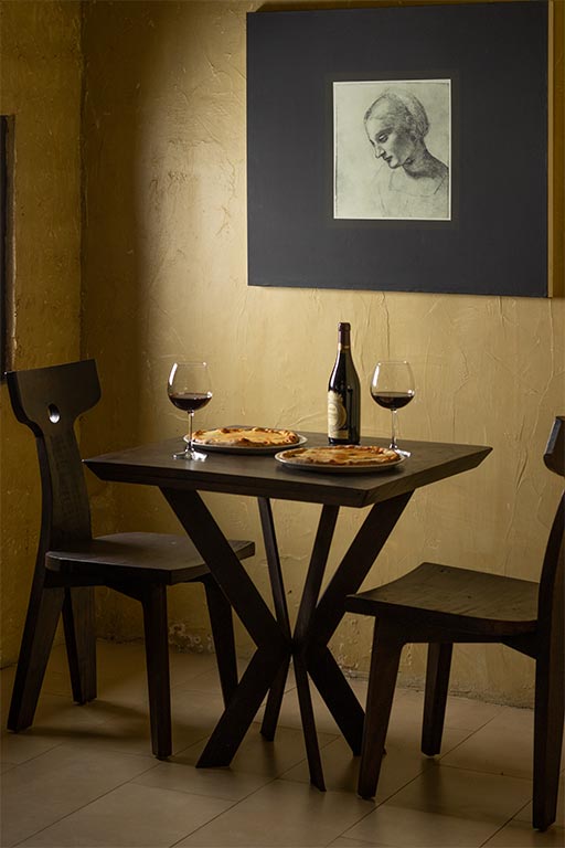
The design was named Bella vita by Leonardo. The entire concept was inspired by Leonardo Da Vinci. Leonardo Da Vinci was a world- renowned painter, architect, and scientist from Florence, Italy, who was prominent in the Renaissance period. Because of artists like him, Italy has been glittered throughout history. The concept of the project was to provide a historic feeling to the space by using aesthetics. There are aesthetic touches in history that we may discover if we walk a little bit back. We did not bring architecture back to the building in Italy, but we gave it an old and worn ambiance. We just wanted to provide a conventional touch to create a setting with an old, worn-out feeling.

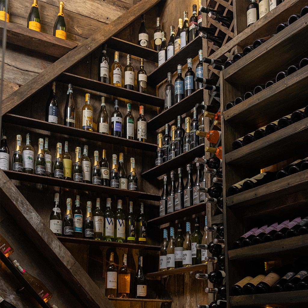
The front part of this structure faces a road frequented by many international visitors, so it should have been designed as an ‘extroverted’ structure. As a result, the interior should have been designed to attract visitors walking down the road. Wine cellar, wood-fired ovens, action kitchens, and ground-level dining areas, as well as clues in the upstairs dining areas to dissuade guests from entering the upstairs dining areas, were all used to draw guests to the restaurant.
The client desired a parking area. Prior to this restaurant, there was no private parking area available. The client asked for a parking area. Previously, the first floor had been abandoned, so I was able to use it for the primary dining area. As a result, I was able to transform the space into a dining area. I extended the upper deck towards the parking lot, and I built two air-conditioned private lounges on the rear of the structure. Moreover, the upper floor was created as an eye-catching element for visitors on the road.
Written by Malinda Liyanage LIYOMARK




Leave a Reply